The challenge of this project was to rejuvenate and reimagine the
branding system for Awbury Arboretum, a privately-owned green space
in Germantown, Philadelphia that is open to the public. The
objective was to create a revitalized brand identity that captures
the vibrant community spirit and the lush natural environment of the
arboretum. The aim was to develop a branding system that effectively
communicates the essence of Awbury, reflecting its welcoming
atmosphere and commitment to preserving green spaces.
Project Goals
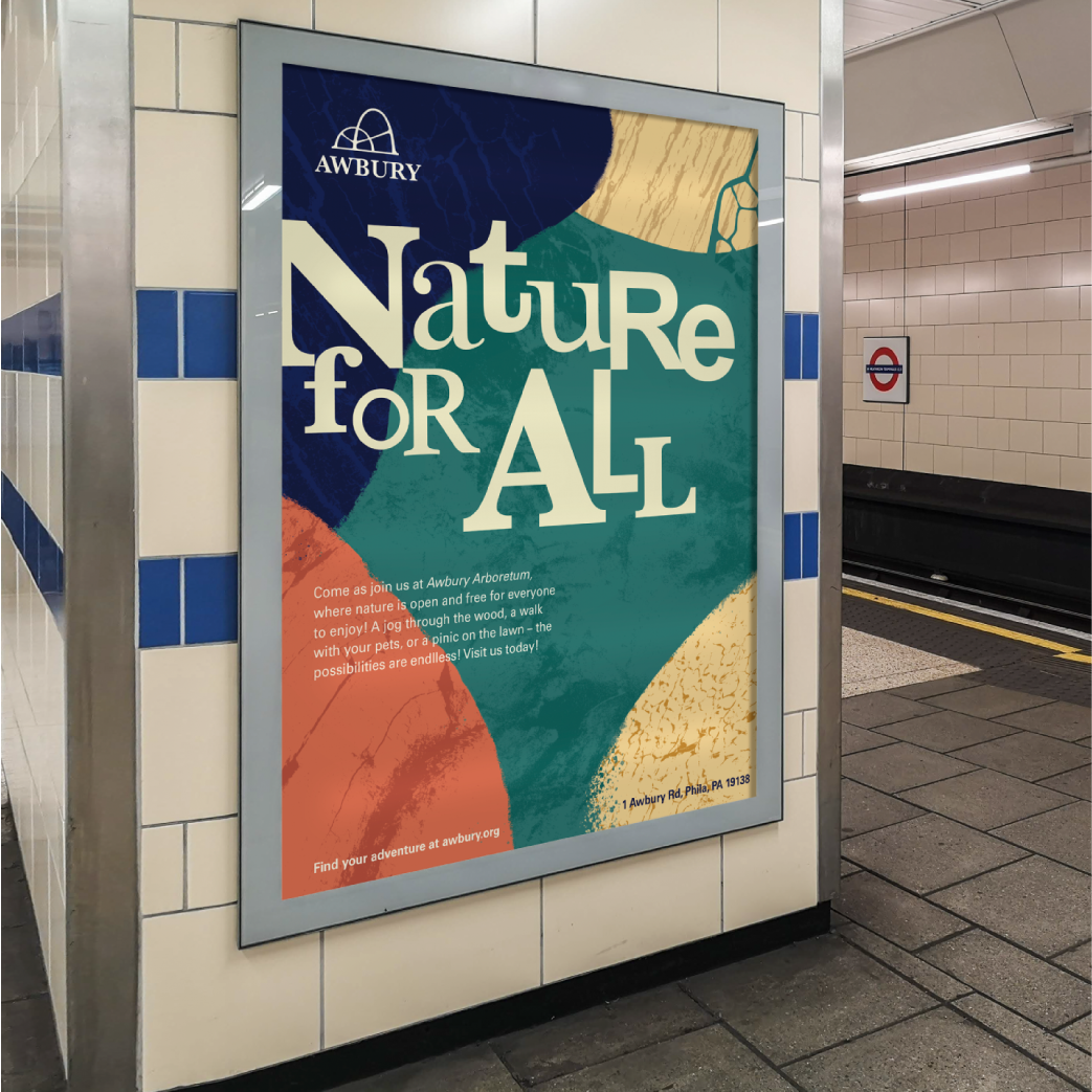
Nature for All
Awbury is first and foremost for the community, the branding
must reflect this collaborative spirit.
Wild and nature
The branding must showcase the wild and organic look the
Awbury's green space and invite adventure.
Distinctly Awbury
The system must differentiate from other arboretums which have a
very polished refined look.
The journey
Lowlevel system
The process begins with creating the logo mark which must reflect
the merging of community and nature. So I combine the name as well
as natural arching form to create the mark.
The color system is inspired from colorful tents inside Awbury's
Adventure Woods, which celebrate natural color and a diverse
collaborative community.
The mark also features a classical serif of Baskerville to reflect
Awbury historic roots back in England and its British
stone-working heritage.
Of nature and community
The graphic system emerged from the blend between community and
nature. The organic forms are taken from stoneworks featured in
Awbury's Cooper House (image seen above)
Textures taken found objects and materials found on-site was
utilized to create abstract and engaging elements that can be
adapted in many different ways to create energetic composition.
This system reflect the collaborative and diverse community of
German town, and resembled a sort of collage and patchwork of
different hands. The type also follow in this spirit and utilizes
different typefaces.
Nature for All
This graphic system was utilized to craft a vibrant and striking
marketing front that emphasize the slogan of "Nature for All"
And the textured graphic also help the system blend well with the
urban environment & also evocative of nature
The colorful pop of different hues also provide a nice contrast
and play well with the funky "found" typography.
The wayfinding system also got a conceptual make-over, featuring a
foldable map that guide the user through the Awbury landscape, all
while retaining the distinct brand visuals style.
The Conclusion
This project was a really fun experience to reimagine a branding
system and revitalize it in a way that engage with the local
community effectively while also appealing to a broader
demographics.